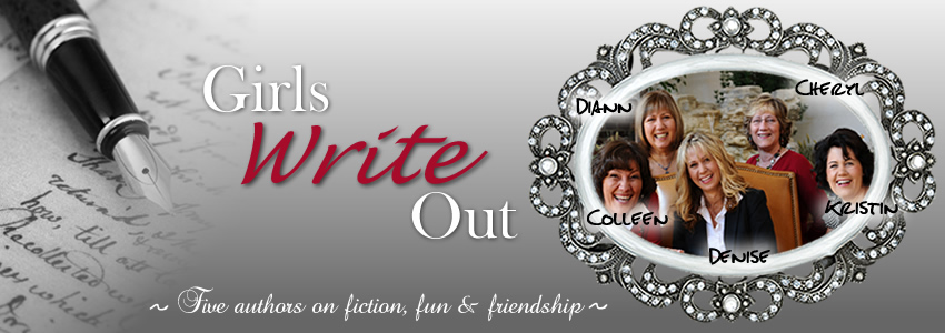
Kristin Billerbeck is a proud Californian, wife, mother of four, and connoisseur of the irrelevant. She writes Christian Chick Lit; where she finds need for most of the useless facts lulling about in her head.
www.KristinBillerbeck.com

Colleen Coble writes romantic suspense with a strong atmospheric element. A lovable animal of some kind--usually a dog--always populates her novels. She can be bribed with DeBrand mocha truffles.
www.ColleenCoble.com

Denise Hunter writes women's fiction and love stories with a strong emotional element. Her husband says he provides her with all her romantic material, but Denise insists a good imagination helps too.
www.DeniseHunterBooks.com

Diann Hunt writes romantic comedy and humorous women's fiction. She has been happily married forever, loves her family, chocolate, her friends, chocolate, her dog, and well, chocolate.
www.DiannHunt.com

Cheryl Hodde writes romantic medical suspense under the pen name of Hannah Alexander, using all the input she can get from her husband, Mel, for the medical expertise. For fun she hikes and reads. Out of guilt, she rescues discarded cats. She and Mel are presently taking orders from four pampered strays.
www.HannahAlexander.com


.jpg)
.jpg)
.jpg)
40 Comments:
They are all great, Denise, but I love number three! I'm getting new photos this weekend. It's always so nerve-wracking. You've got awesome choices.
Number 3.
I like number two!
NUMBER 3! (that's me shouting in excitment and jumping up and down)
Yep, decided on no 3 before I read everyone else's comments :)
I think I like number 4 the best.
They are all great though.
I like number 3 and 4! You are very photogenic which means - hard to choose!
Blessings,
Lucie
Denise, I liked #3 immediately and #4 second. But we seem to see a lot of pics with people leaning against trees LOL.
Number 3 it is in my humble opinion.
My daughter and I both like #2 best, then #3.
The tree pose reminds me of senior pictures back in the 80s. Going back to that discussion we had not to long ago about senior pics and poses...those were the days, huh?? :-)
Number three is my favorite.
They're all really great. You'll have to fill your husband's wallet with them too. :)
I vote number three. It just really grabs me as that back-of-the-book author photo.
Casting 3 out of 3 votes from my family for #2!
from Bangkok,
Sheila
I like the first one--but it looks like I'm outnumbered!
I like #2 and #3 --- #3 looks more back of the bookcover-y though...
I like 3 and 4 also. I think you look amazing in these pics and you should probably go with #4 because it shows your wedding rings and that way no man will think that you're available *grin*
Love the outfit in 1 but 3 is the most women's faith author pic. :) Very nice, Denise. =)
I like #4, and my hubby likes #2. I do like #3 too. Hmm, quandary.
I'm a huge fan of number 3!! They are all beautiful though! :)
Four, and then three. :)
Denise, those are all great pictures! I #3 the best.
Oh, wow! You're beautiful, Denise! If I have to pick, I think #3 looks most 'authorish', but I love them all!
I love 3 and 4. They are all good, but three and four are my favs.
Beautiful!
Rachel
They are all gorgeous (how could they not be with you as the subject?!) but I agree with those who've said #3. #2 is my second pick, but #3 has a sweet, yet a tiny bit mysterious quality about it. I love it!
Beautiful pictures, Denise. I like #4 the most.
I like number 1. My second choice, and so far the favorite of many, is number 3.
Number 3 all the way, Denise! I saw you wear that necklace at ACFW, and thought how PERFECT it was for the type of stories you write! Very romantic.
I do think the closeness of your face on #3 is best for a book cover, but #2 is in best focus. However, #4 fits the mood of your writing and you are smiling, which I really like. You don't happen to have #4 in color, too, do you? I love #4.
They are all great so you can't really go wrong--you're so photogenic and Amber is a good photographer!
I like #4 because you look approachable, but I would like it in color. My husband and daughter liked #4 the best, too.
I really like #3 the best, although all of them are gorgeous. I need to update my headshot, but just don't have the money right now...especially with a baby coming.
But, after reading comments, looks like I'm in the majority. :)
Love no. 3!!!
Oh, my gosh, you guys are the greatest! Thanks so much for your help! A
nd no, I'm not really photogenic, but when someone as talented as Amber is taking like 50 zillion photos, you're bound to turn up a good one or two. LOL
Beautiful! Number 3, definitely.
#3 definitely!!!!
I like number 3, I love the pendent on your nackace!
And the last one with the tree is very romantic.
they all look wonderful but I love the tree one and the one above but the more I look the more the tree wins.
Denise you look beautiful. Amber did a wonderful job and I can you you are really happy.
I like 3 and 4. I guess it depends on whether or not the photo will be printed in color or black and whiite.
I like #3 and #4 the best. four the most but they're all fabulous.
You're beautiful! I like #1 & #4 the most, but #3 looks more like a book pic. :)
cheryl
Well, I'm going against the grain here, but I LOVE the B&W one, mainly because it's B&W. It's different. The main reason is that your head is kind of cut off in the others
I am visiting my own personal photographers... so I have three opinions.
We all agree that we like #3 the best... They suggest that the colors get warmed up just a bit, which in my uneducated eyes looks like they cranked up the brightness just a tad, in the process. "More contrast" is the phrase they gave me.
Not for the dust jacket, but two of us (the girls) really like #1... maybe as a header on your web page. We like the clothes in that one the best.
Post a Comment
<< Home