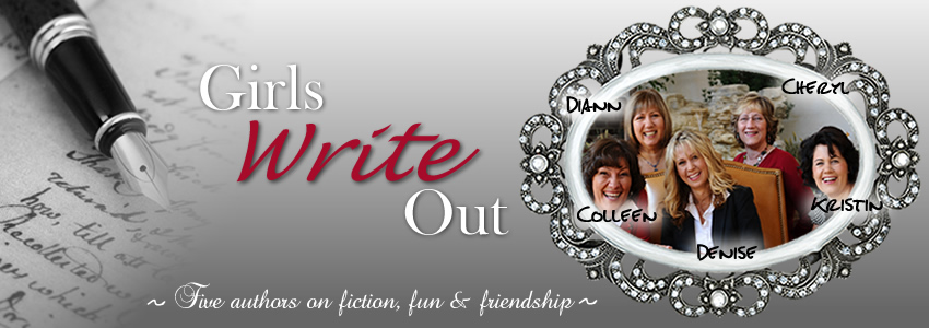


Labels: book covers, Kristin Billerbeck, Young adult
| Tweet |
Colleen Coble writes romantic suspense with a strong atmospheric element. A lovable animal of some kind--usually a dog--always populates her novels. She can be bribed with DeBrand mocha truffles.

Denise Hunter writes women's fiction and love stories with a strong emotional element. Her husband says he provides her with all her romantic material, but Denise insists a good imagination helps too.
Diann Hunt writes romantic comedy and humorous women's fiction. She has been happily married forever, loves her family, chocolate, her friends, chocolate, her dog, and well, chocolate.
Cheryl Hodde writes romantic medical suspense under the pen name of Hannah Alexander, using all the input she can get from her husband, Mel, for the medical expertise. For fun she hikes and reads. Out of guilt, she rescues discarded cats. She and Mel are presently taking orders from four pampered strays.
39 Comments:
Definitely the first one. It seems more personal than the one that is more in the background.
the one on the left, where she is wearing the dress. Can't wait to read it!!!
they both look so good!!!!! if i had to pick though, the one on the left. can you use the second cover for the sequel???
First, is the title supposed to be a play on words? Implying that she seems perfect, so why is she dateless? If so, I am definitely for the first cover on the left. She looks perfect, yet, she's alone. Hmmm... Why is she alone? Is something wrong under all that perfection?
Second, even if the above is not the case I still like the first one. Although the formal dress hanging all alone with no where to go is a great idea. :)
I like the one on the left, which means you should probably choose the one on the right (since it's for teens and not, um, the young at heart like myself, lol)
Enjoy Denver. Don't forget to stop by The Tattered Cover bookstore!
I'm 27, so not YA anymore, but the pink dress screams old and dowdy to me. The blue looks more youthful.
I like both, but I think I like the one on the right, the blue dress stands out, and it looks more like a dress my niece who's right in the YA (akk did I just have to admit I'm middle aged) category would wear. She would never wear the one on the left.
My 14-year old says the blue dress looks more hip. The pink one looks little-girlish and ballerina-like. She would choose the blue dress any day.
She would choose the cover on the right because she isn't into frilly pink stuff and the other cover would make her more interested. Only if the back material and/or teaser is REALLY interesting would she read the book with the pink dress cover.
So there you have it, from a girl who's looking for her own first homecoming dress! :-)
More from the teen--if the blue dress was on a girl in the same position as the pink, it would make it even MORE interesting.
I would have chosen the pink, but I'm old. LOL
I am a teen, and the pink cover with the blue dress attracts me more. The one where she's wearing the dress looks outdated, more like adult chick-lit. If I were browsing by covers, I'd pick the one on the right.
the blue dress cover stikes me more! for some reason it reminds me of "Never the Bride", but that one is more close up and is a different color. Trying to find the book to jog my memory. it has a dress hanging on a door tho. I like how this one is hanging on the words.
~Mimi B
Love the pink dress. I think it looks more like a novel for teens.
I like the one on the left w/ the girl wearing the dress...but if the teens out there think the pink dress is outdated, maybe change up the dress and still have the girl wearing it? I like that there's a real person on the cover - I'd pick that book up before the other one. =)
Thanks everyone, you guys rock. I so appreciate the feedback!
I like the pink dress, the other one just looks like a dress hanging all alone, and the pink one look like a pictuer.
mamat2730(at)charter(dot)net
Initially I liked the one on the left, but after reading the comments and looking at the covers again I have changed my mind. Now the one on the right works better for me because it says she doesn't have a date, and she is not going out because it is still on the hanger. Plus, I do recall seeing a lot of bold colors with floating images on the covers of YA fiction. Good luck! I think they're both great.
Kim and I like the one on the left with the girl's arms because of its sweetness and vulnerability.
I think the cover on the right definitely is more youthful than the one on the left. The left cover says adult chicklit to me.
I like the one on the right.... the one on the left... for some reason the person frightens me. =)
I like the first one. I feel more compassion for her...or connection. Haven't read the novel yet so I don't know which she needs:-)
My 11-year-old (the real authority) & I both like the one on the right...
I like the one on the right--the blue dress. It implies youthfulness (the type of dress girls are wearing) and it is not being used--on a hanger with no place to go...dateless.
The one on the left seems old-fashioned, almost Cinderella-like, I suppose.
I lile the one on the right :)
The first seems a little young, but you did say it was for young adults.
Sometimes, I like that I don't see the character. As I read the book, the character develops and I get to know them even better. The picture of what I think they look like, along with the descriptions of each character written in the book. Since all of you do such a good job of describing the people in the book, I find it just is better for me. There have been times when I see a real person, I haven't picked up that book first.
Again, this is me -- I do have 2 grandchildren but am "young at heart". Not that I am OLD....
I just looked at the cover again. Now, I am not sure! The one on the left does look sweet, innocent and waiting for her knight in shining armour to come through the door. Maybe her first date? I feel the expectations she is having are high.
As for the cover on the right, the iting. I think she is getting ready to slip the dress on at the last minute to go OUT on the date.
Ok, I have officially changed my mind. The book cover on the left :)
I like the one with the gal and the dress...both are really fun though.
I vote the one on the right, with the blue dress on the hanger. If it's about being dateless, why would someone be dressed up for a date? Instead it should be a dress on a hanger, no where to go. Hope it helps!
Being old enough to remember when there wasn't a YA catagory, I choose the on on the right. The blue stands out and does seem to convey the thought of the title.
The pink dress is from another age, the 1950's and could be considered juvenile.
I like the first one best. A real person on the cover implies a real problem. I can connect with that. The other is too ambiguous.
I like the first one best. A real person on the cover implies a real problem. I can connect with that. The other is too ambiguous.
I asked my 12 year old daughter and she says the one on the left, but also said (on her own) that the hanging dress made sense. BUT her initial reaction was the one on the left.
I agreed with her.
I like the one on the right with the dress hanging. I think it fits the title being on the hanger as if she is staring at it, not in it and stood up (unless that is what it's about).
I like the cover on the right. The title is more distinct, and I think the dress on the right makes for an Audrey Hepburn look--one I personally adore--but wouldn't think teens would relate to.
I think the one on the right gives a starker comment about being left behind in the dating process. It has a little more bite and pain associated with it that the one on the left. But I cannot decide between the two if it comes to which one I like better.
I like the pose of the first one. But I"m not sure about either dress. But either way, I love the cover and either cover is attention getting. Can't wait to see this book on the shelves!!!
I like the right one w/ the blue dress. It's sharper, not as busy and that blue dress pops! Bolder, cleaner lines. Fonts easier to read. The idea of the dress hanging on the hanger fits with the title. And, gotta feel for that spunky gown and corsage with no where to go! Good luck. They're both great.
absolutely the right! i'm actually disappointed with the re-design of the ashley stockingdale series. literal = boring.
To me, nothing will replace the original on the Ashley covers. I think they did the best job for the new market, but I prefer the cartoons. I think they're perfect!
absolutely the right! i'm actually disappointed with the re-design of the ashley stockingdale series. literal = boring.
absolutely the right! i'm actually disappointed with the re-design of the ashley stockingdale series. literal = boring.
Post a Comment
<< Home